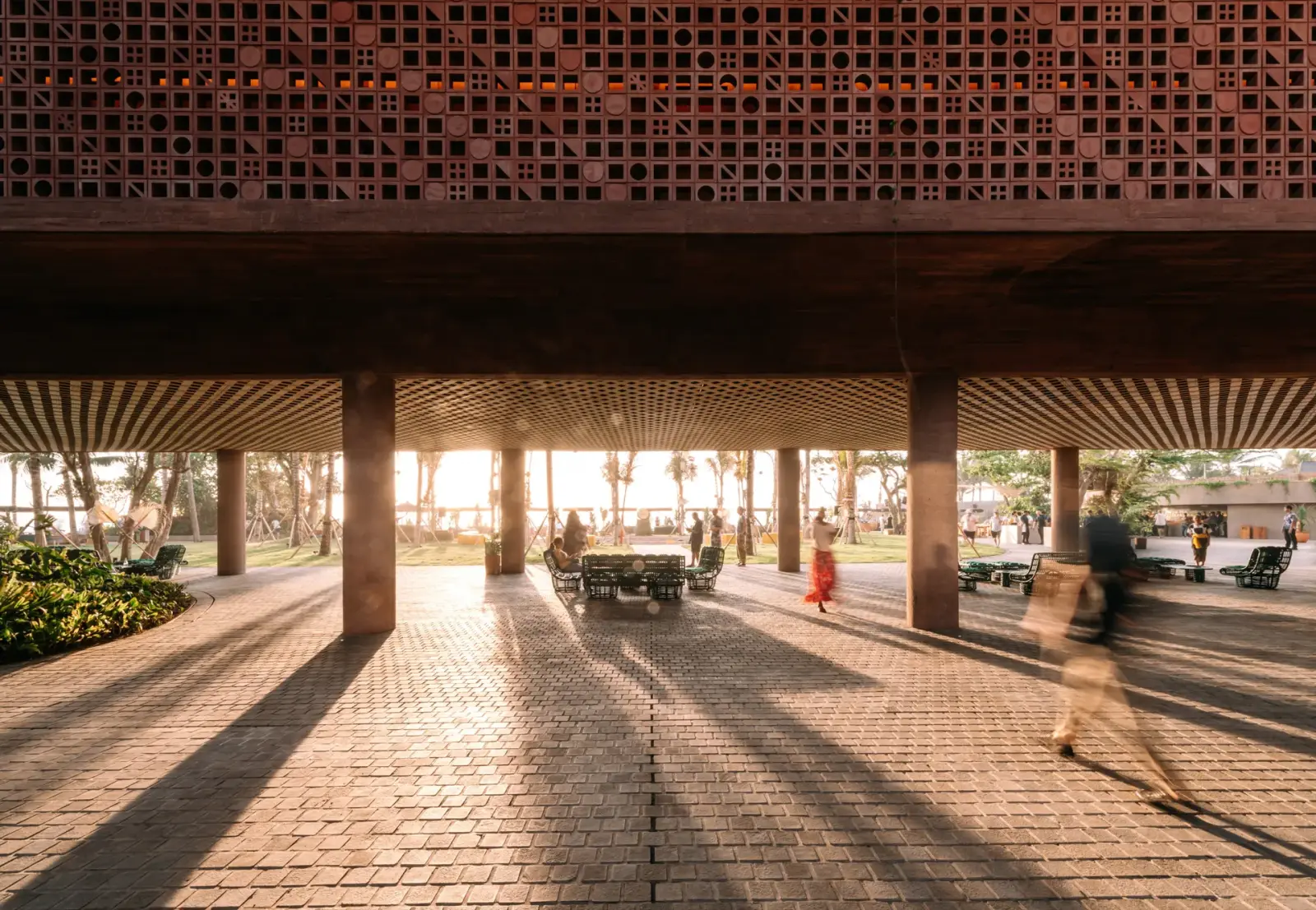
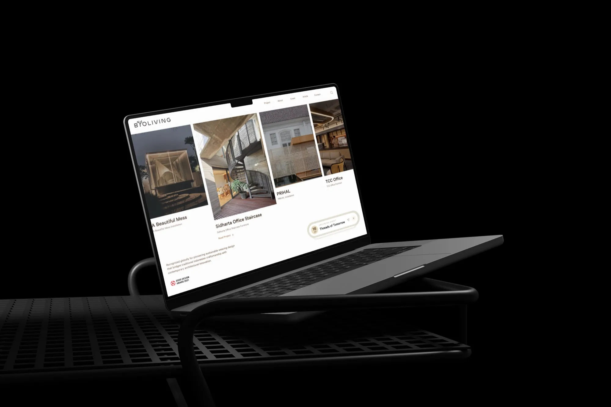
BYO Living is an award-winning weaving atelier whose product only makes sense at building scale — a woven bamboo ceiling in a hotel lobby, a facade system, a staircase wrapped in natural fibre inside a corporate headquarters. Their previous website sold that work as a product catalogue, so an architect hunting for ceiling systems had to scroll a flat page and guess. We rebuilt it as a portfolio: every project mapped to the application it solves, an index that filters the way a specifier thinks, and a single project template the team can publish into without a designer in the loop.
Key Takeaways
- The brief was not "make it look better" — it was make the body of work findable, because BYO Living sells credibility more than catalogue items.
- We started with information architecture, mapping each project to its application (ceiling, cladding, facade, partition, furniture, installation) and its sector.
- The project index ships in two views: a grid of covers for browsing, and a list with location, architect and year for comparing.
- One reusable project template — a sideways-scrolling page that alternates text panels with full-height photography — matters more than one beautiful page, because it is what lets the client keep publishing after handover.
- The visual language was kept deliberately quiet so the photography carries the site, not the interface.
Who is BYO Living, and what was the brief?
BYO Living hand-weaves bamboo, rattan and other natural fibres into architectural surfaces: ceilings, cladding, facades, partitions, furniture and large-scale installations. The work sits inside hospitality, office, government and residential projects, and it has been recognised with international design awards.
That business has an unusual property. Nobody buys a woven ceiling from a product photo. They buy it after seeing it installed at scale, in a space that resembles the one they are specifying for. The website's job, then, is not to sell an item. It is to prove a capability.
The old site did not do that. Projects were hard to browse and impossible to filter by application. Awards, exhibitions and upcoming events had nowhere to live. And the strongest asset the brand owns — its photography — was competing with the interface instead of being carried by it.
Why did we start with information architecture, not visuals?
Because on a portfolio site, structure is the design decision. Everything downstream — the homepage, the templates, the navigation — is a consequence of how the work is organised.
So before a single screen was designed, every project was mapped against two axes:
- Application — the problem the surface solves: ceiling, cladding, facade, partition, furniture, installation.
- Sector — where it lives: hospitality, office, government, residential.
Those two axes came from how architects and interior designers actually search. A specifier rarely arrives thinking "show me everything you have made." They arrive thinking "show me what you have done for a hotel facade." Structuring the catalogue around that question is what turns a scroll into one click.
This is the step most portfolio redesigns skip. A visual refresh on top of an unstructured archive produces a prettier version of the same problem: the work is still there, and it is still unfindable.
What did the homepage need to do in the first five seconds?
We gave the homepage exactly three jobs, in order: state what the atelier is, prove it, and push visitors into the work.
The opening line does the positioning — an award-winning weaving atelier, not a supplier of woven panels. Awards and international recognition sit directly underneath as proof, because for a specifier bringing a vendor to a client, credentials are the thing they need to forward. Then the page hands over to the projects. Nothing else was allowed above that handover.
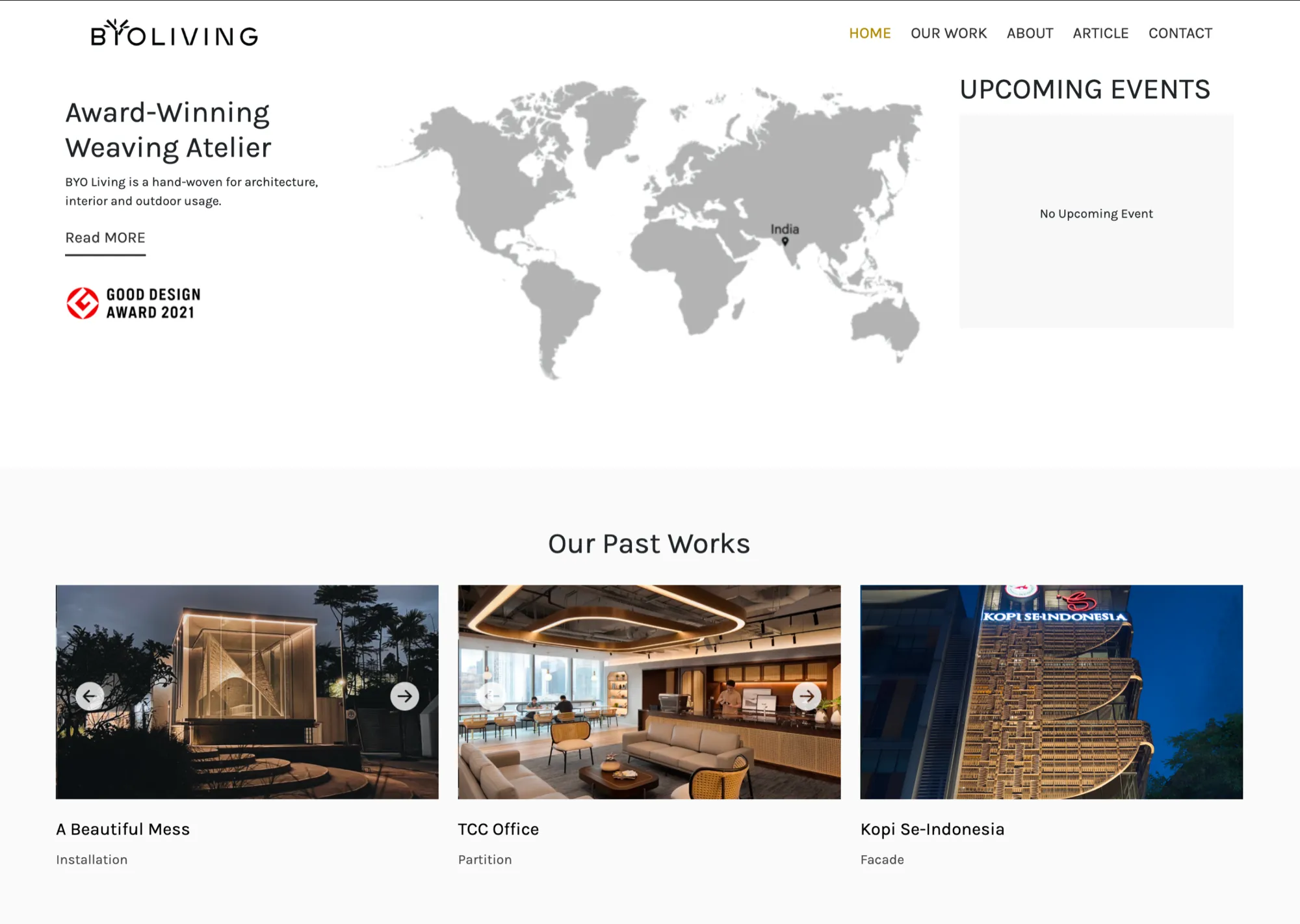
Exhibitions and events got their own home too — a dated notice that announces an upcoming show and can be dismissed. It is a small component, but it solved a real problem: time-sensitive news used to have nowhere to go except a homepage rebuild.

What does a project index look like when it is built for specifiers?
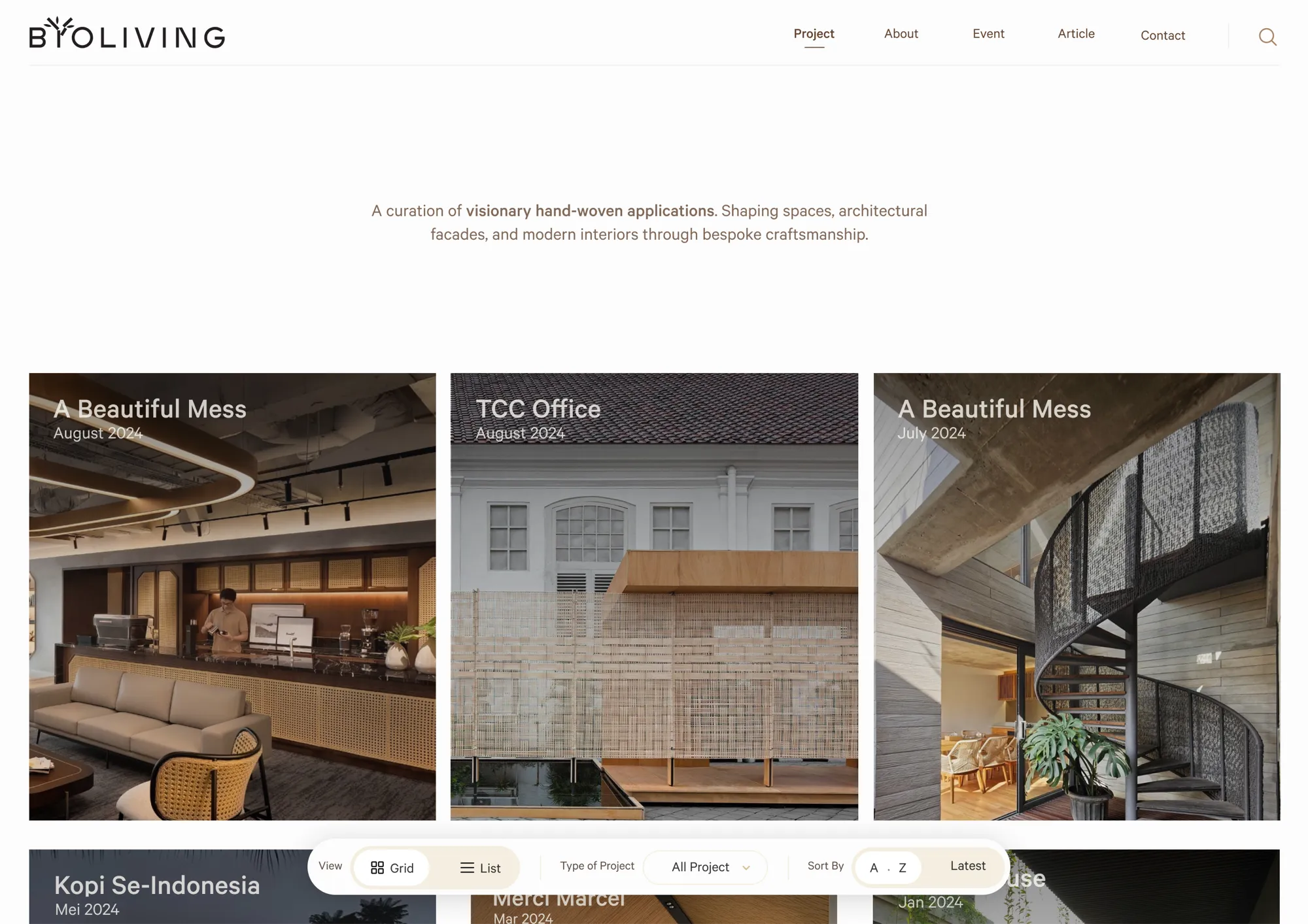
The index is the heart of the site, so it carries two modes rather than forcing one. A floating bar switches the view, filters by project type, and sorts.
Grid view, for browsing
The grid leads with cover images. It is the mode for someone forming an impression — scanning for materials, scale and finish. Filtering by application narrows it in place, so a visitor looking for ceiling systems is one click from a wall of ceilings.
List view, for comparing
The list strips it back to project name, location, architect and year, with the cover previewing on hover. This is the mode for the visitor who already knows what they are looking for and is checking whether the atelier has done it before, nearby, and recently. Same data, different question.
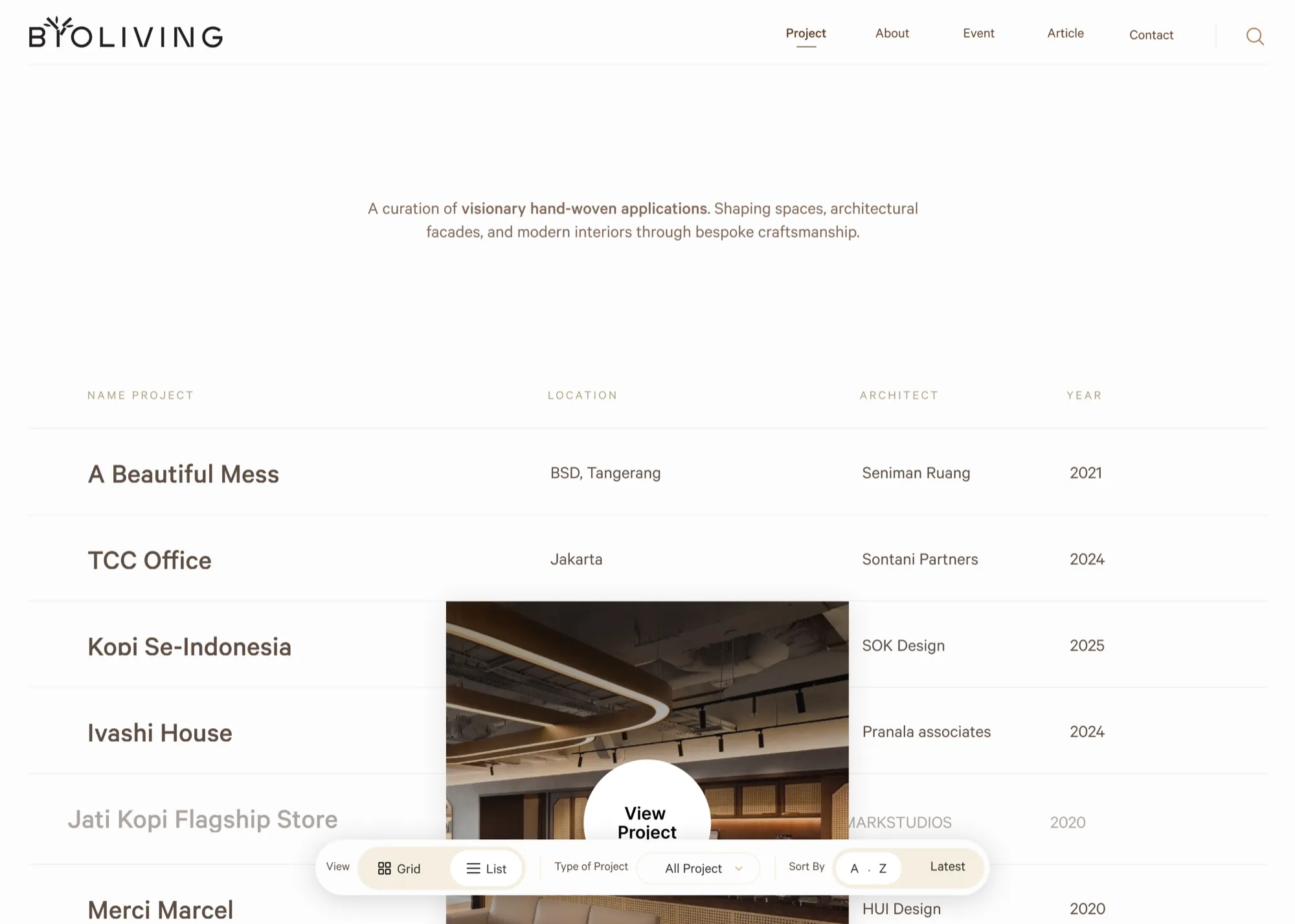
Two views sound like a luxury. In practice it is cheaper than it looks: both read from the same project records, so the cost is one extra layout, not a second content model.
Why does one project template matter more than one beautiful project page?
Every case follows the same shape, in the same order:
- Title panel — project name and location, a short brief, and a specification block: architect, material, location, weave pattern.
- Our Challenge — the constraint the project set, paired with a close-up of the weave used to answer it.
- Our Solution — how the atelier solved it, set on a sand-coloured panel that breaks the run of photography.
- The gallery — full-height photographs of the installed work, interior and exterior.
- See Similar Project — two related cases and a contact button, so the page ends in a next step instead of a dead end.
No bespoke layouts, no one-off pages. That constraint does two things. It keeps the fiftieth project as coherent as the first, no matter who adds it. And it removes the agency from the publishing loop — the team can put up new work themselves, which is the difference between a site that ages well and one that quietly goes stale six months after launch.
Why the project page scrolls sideways
The page moves left to right, not top to bottom. Text panels and full-height photographs alternate along one horizontal track, so you read a project the way you would walk a showroom wall.
That was a deliberate call, and it follows from the photography. Architectural interiors are shot wide. Stacked vertically, a wide image becomes a thin band with a lot of empty page around it; laid out horizontally, each photograph gets the full height of the screen and a room arrives in one piece. The specification block sits in the opening panel rather than at the bottom, so architect, material and pattern are visible before any scrolling happens. A close control stays pinned in the corner throughout, so a visitor drops back into the index without losing their place.

The Iyashi House page end to end — drag the strip sideways to move through it, the same gesture the page itself uses.
Horizontal scrolling is not a free choice. It breaks the reader's default expectation, it needs a visible cue that there is more to the right, and it has to fall back gracefully on a phone. It earns its place here because the content is a sequence of wide images with short captions — which is exactly the shape the pattern suits, and exactly why it fails on text-heavy pages.
If you take one thing from this build, take this: design the template, not the page. A portfolio is a system that has to keep receiving content, and the handover matters as much as the launch.
How do you design around photography instead of on top of it?
When the imagery is the product, the interface has to get out of the way. The visual language was kept deliberately quiet:
- Warm neutrals drawn from the material palette itself — bamboo, rattan, timber — so the interface never argues with the work.
- Restrained typography, used for hierarchy rather than personality.
- Full-bleed photography given room to breathe, with generous space around each image.
Restraint is not the absence of design. It is a decision that costs something: fewer places for the brand to shout, less visual novelty, more discipline in the layout. On a site where a single photograph can close a specification, it is the right trade.
The whole thing is responsive, which is less obvious than it sounds for this audience. The site gets opened on a phone in a site meeting as often as on a studio monitor, so the photography had to hold up at both ends.
What did BYO Living end up with?
A portfolio that reads like a showroom. The site opens with positioning and award credentials, surfaces upcoming exhibitions, and moves visitors straight into the work. The index filters by application and sector and reads either as a grid or as a list. Each project page follows the same structure, so the team publishes new work without a designer.
"What I really admire is how they advise you on what is possible and what is not, and offer a better solution when something does not actually match our needs. They took notes on every requirement and every pain point, and they have an eye for even the smallest details. Would I recommend them? Absolutely." — Galuh, BYO Living
The full walkthrough, with more screens and the video review, lives on the BYO Living case study.
What would we carry into the next portfolio build?
- Audit the archive before the aesthetic. List every project and the attributes buyers filter by. If you cannot name those attributes, you are not ready to design.
- Borrow the taxonomy from your buyer, not your org chart. BYO Living's internal categories were about materials; the site is organised by application, because that is the question being asked.
- Give time-sensitive content a permanent home. Events, awards and exhibitions will exist next year too. Build the slot once.
- Ship two views before shipping two designs. A second reading of the same data usually beats a second page.
- Treat the handover as a feature. If publishing a project needs a designer, the portfolio will stop growing.
None of this is specific to woven bamboo. It applies to any studio whose product has to be seen at scale to be understood — architecture practices, fabricators, furniture makers, contractors, photographers. The pattern is the same: the work is the pitch, and the structure decides whether anyone reaches it.
Frequently Asked Questions
How long does a portfolio website like this take to build?
A portfolio site of this scope typically runs six to ten weeks end to end, with the first one to two spent on information architecture and content mapping before any design work starts.
Do I need professional photography before redesigning my portfolio site?
If your product has to be seen at scale to be understood, yes — photography is the single highest-leverage asset, and a restrained design only works when the images can carry it.
Should a portfolio site be filterable, or is a simple grid enough?
A simple grid is fine under roughly twenty projects; past that, visitors stop scrolling and filtering by the attribute your buyers actually search for becomes the difference between finding your relevant work and leaving.
Can my team update the website after launch without a designer?
Yes, if the site is built on a consistent project template rather than bespoke page layouts — that is a decision made during design, not something that can be added afterwards.
What does Lenka Studio do on a project like this?
We handle UI/UX design, web design and web development as one engagement, from the information architecture through to the responsive build and handover — you can see the scope on our services page.
If you have a body of work that deserves a better home, we would like to see it. Tell us about your project and we will come back within 24 hours with a free consultation — no strings attached.